

Template Manual
We’ve developed a method of working in Squarespace that’s intuitive, functional, and more consistent across designs. Instead of trying to add custom elements to Squarespace, we modify the underlying structure — meaning, you don’t have to be able to code, just use the platform as intended. Let’s get started.
Table of Contents
Split Sections
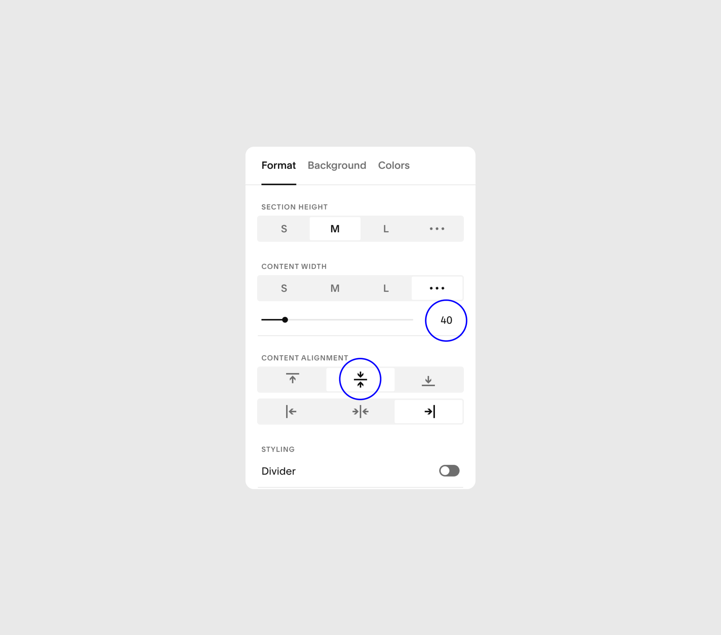
Squarespace still doesn’t offer native split sections, so we made our own. Here’s how it works in Learnable (and all SM templates):
1. Add a Section Background Image
2. Set the Content Width to 40 or 50
3. Align content to the left or right
4. Pick a Section Height
Content Width 40 + Center
This width splits the page perfectly down the center (don’t ask why they didn’t make this the setting for 50). Align text left or right to activate, and use top or bottom align for new layouts.
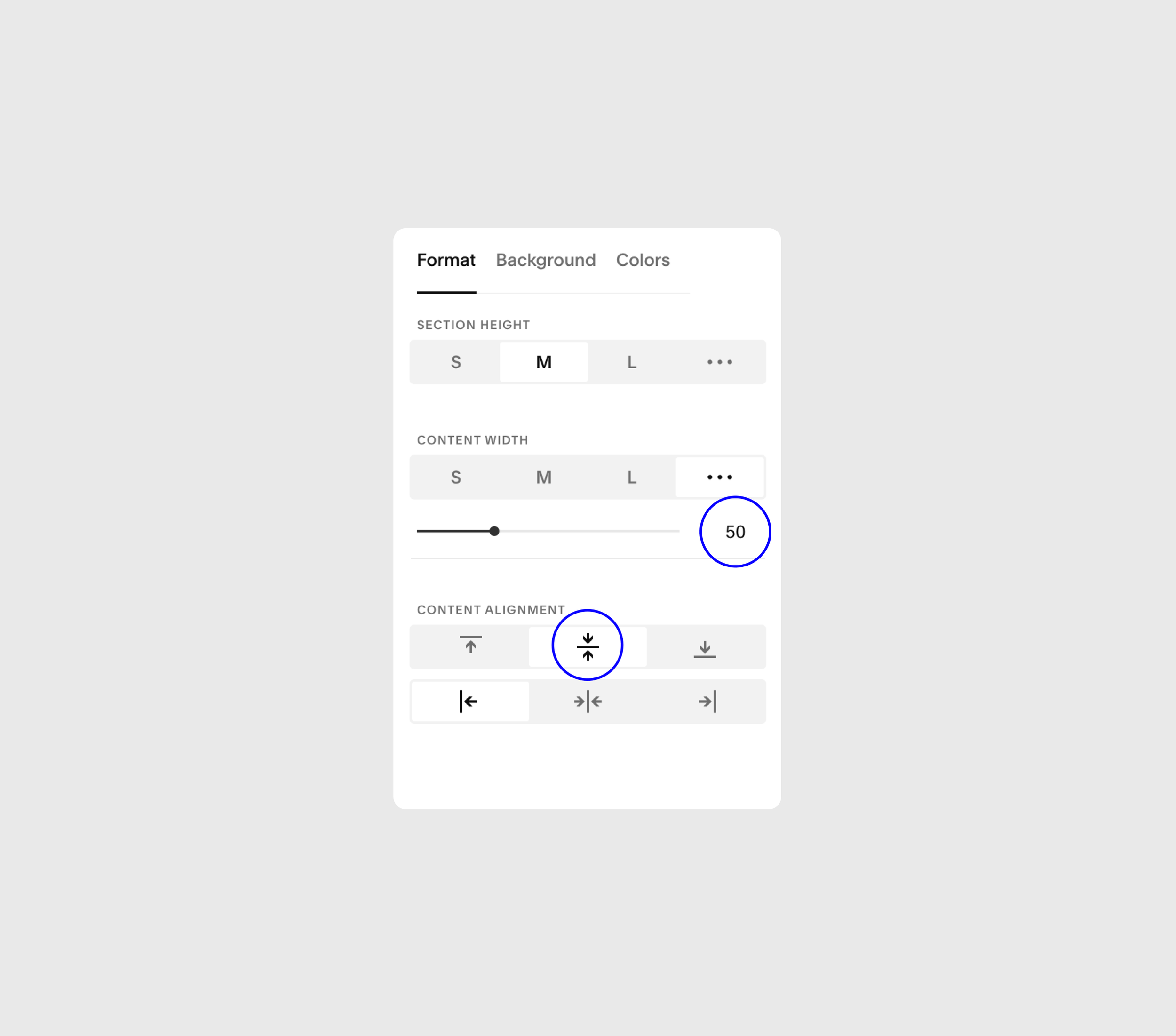
Content Width 50 + Center
This width gives an approximately 60/40 split to content. This works well to display more vertical images and display a lot of text at larger font sizes.
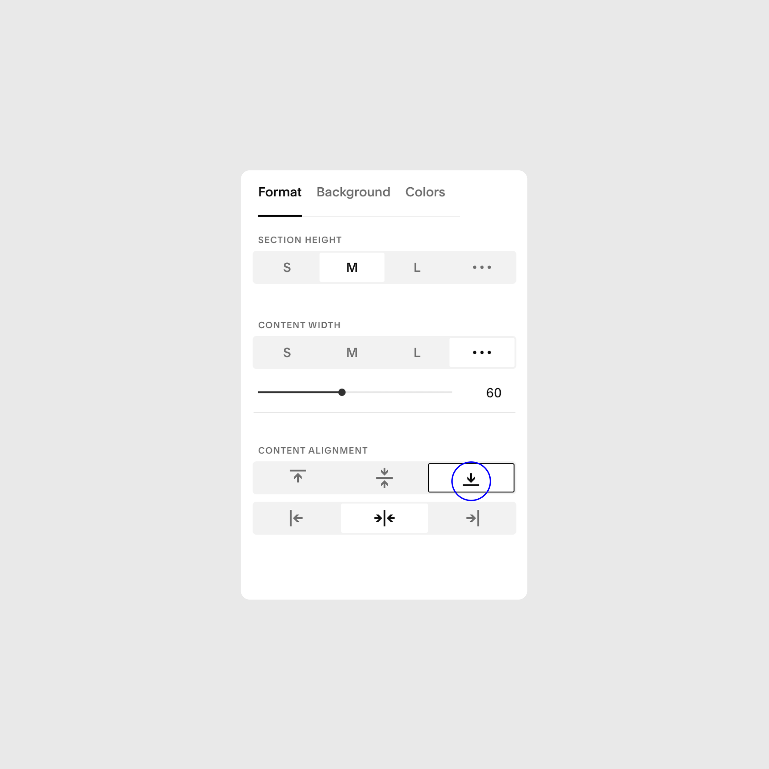
Content Card (Bottom Align)
Background Cards are a great way to break up pages and give sections some interesting layouts. To make one, simply select “bottom” in the Content Alignment section. Be wary of overlapping, so you don’t cut things off.
Note
I’ve pre-selected the alternate background color that contrasts the color of the Background Card. For example, “White 1” has a white Card color, and a light background. Try a few different color themes to find the right one.
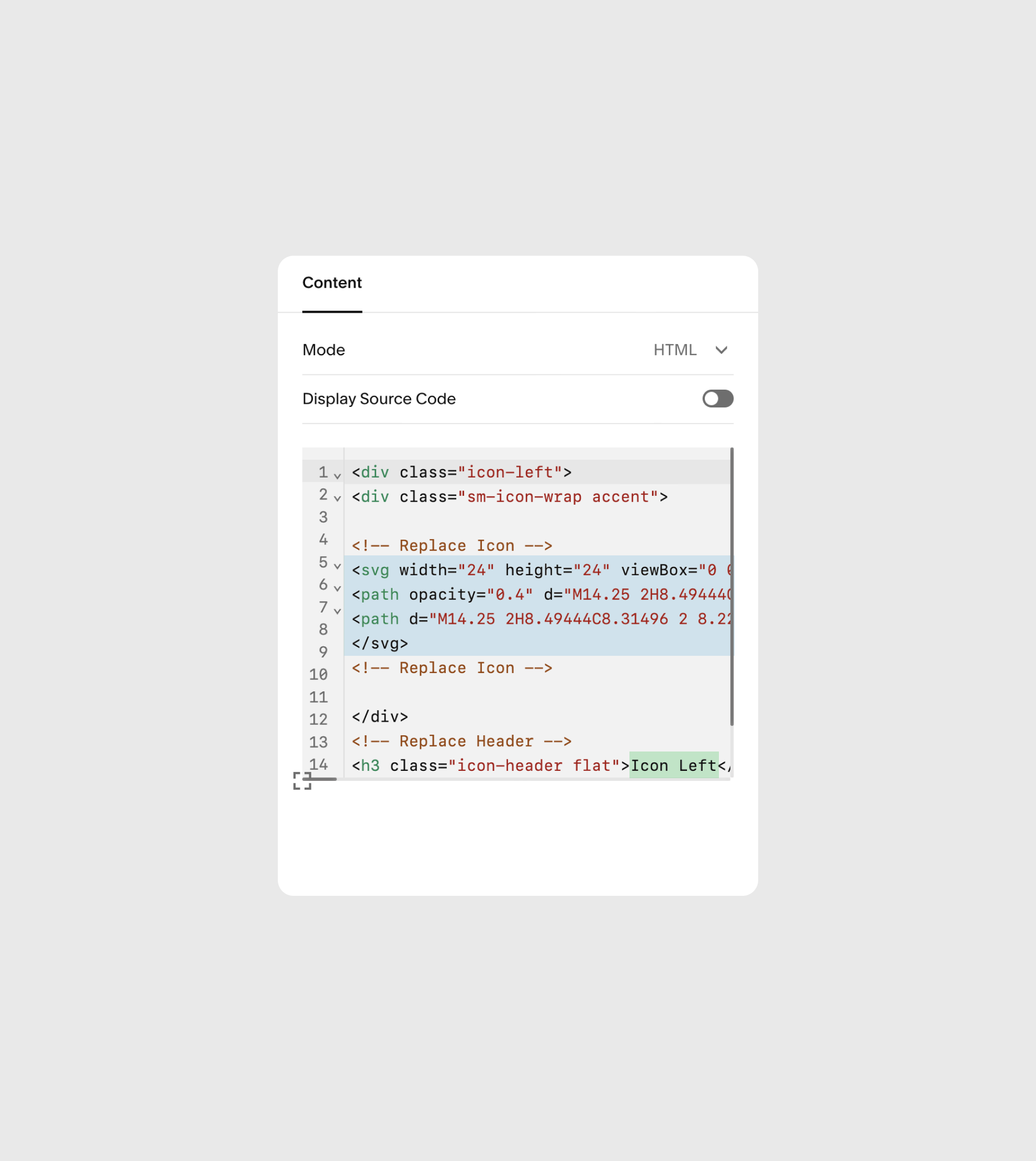
Changing Icons
Installing your own icons can seem tricky, but I promise it can be done! To make things easier, just copy/paste existing icon code blocks and follow these instructions.
1. Download an SVG icon from somewhere like The Noun Project. It cannot be a PNG! Make sure it’s already in the correct color that you want to use (most on this template are white)
2. Right-click on the file and “Open With” > TextEdit.
3. Next, in Squarespace — while editing the page, double-click on the code block containing the current icon.
4. Copy + paste the new code you just viewed in TextEdit, replacing the highlighted code you see here.
5. It’ll probably be WAY too big at first, and that’s okay. To make them the right size, just change the “height” & “width” values to something like 24px to fit within the circle container.
6. Now for the headlines — At the bottom of the code, you’ll see the H3 tag. Replace the copy that’s there with whatever you want next to or below the icon. See two icon blocks for reference.
Icon Left
Icon Centered
Contact Forms
Forms are really easy to make messy, unprofessional, and out-of-hand with design — so, we make it super simple. A few rules you should follow with any forms you make with this template:
Single-Span Fields — Whatever form fields you want to include, only use ones that span one field-width (not phone number, address etc). Text fields, multi-select, and dropdown work great.
Field Split — The first four fields will split equally in half, so make sure to adhere to the first rule to keep everything looking good.
Only Description — We hide the field label and only show the description to reduce visual clutter. But, make sure to still complete the label section for auto-fill use.